


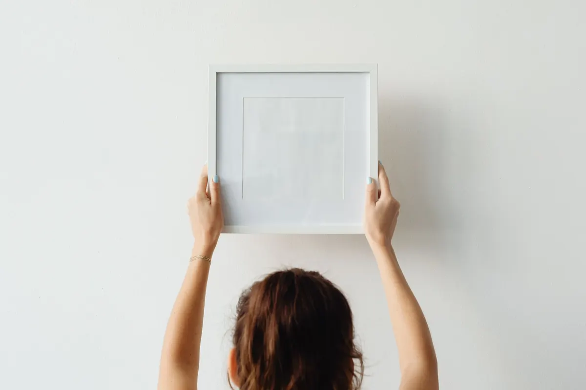
There is a particular kind of procrastination that happens with wall art. You buy the print, frame it properly, then lean it against the skirting board for three weeks because the wall has suddenly become a decision. Hanging art is not difficult, but it is unforgiving. A few inches in the wrong direction and a good room looks slightly off, and nobody can say quite why. Most of the trouble comes down to four things: height, scale, spacing and hardware.
The Eye-Level Rule Is a Starting Point, Not a Law
The most repeated piece of advice in hanging art is that the centre of the piece should sit 57 to 60 inches from the floor. That figure comes from gallery practice and roughly matches average standing eye level, which is why it works so well in hallways, stairwells and rooms where people are usually on their feet.
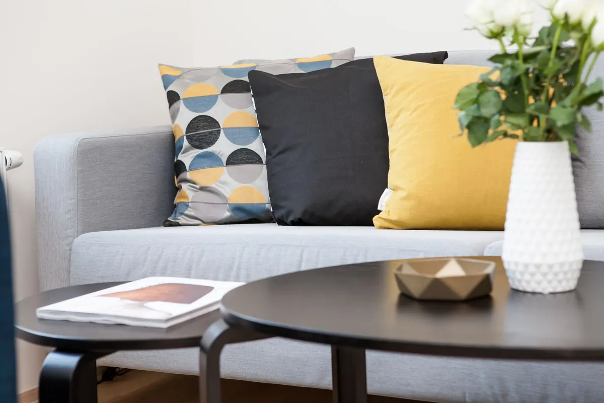
Where it goes wrong is when it is applied everywhere. Above a sofa, art needs a relationship with the furniture, not with the floor. Aim for 6 to 10 inches of clear wall between the top of the sofa back and the bottom of the frame. On a low sofa in a tall room that will push the centre well above 60 inches, and that is exactly right, because nobody looks at the wall above a sofa while standing up.
The second common error is lining the tops of frames up with door heads, window tops or the top of a wardrobe. It looks tidy on paper and wrong on the wall. The eye follows the line of the frames themselves, so a row that steps about because the ceiling slopes, or because one frame is taller than the others, usually reads better than a hard horizontal line that ignores the shapes of the pieces.
One exception worth knowing: in a dining room or a snug where you spend most of the time seated, hang slightly lower and slightly closer together than you think you should. The arrangement will feel generous when you are in the chair looking at it.
Art That's Too Small Makes a Wall Look Smaller
A wide empty wall with one modest print on it does not look minimal. It looks like a mistake. The usual culprit is buying art because you love it, then discovering it's a small A3 frame on a three-metre wall.
A useful rule of thumb: the total width of your arrangement should cover roughly two-thirds to three-quarters of the width of the furniture beneath it. Over a 2-metre sofa, that means somewhere around 1.3 to 1.5 metres of art. One large piece will do it, or a pair of matched frames in wide mounts, or a group of three to five smaller pieces hung as a set.
Wide matting is the cheapest trick in framing. A generous mount, 7 to 10cm around a small print, gives the artwork presence without costing what a large frame costs, and it stops a small piece from looking stranded. Grouping three small prints in a tight vertical stack is another fix that works almost anywhere: a narrow wall, the gap beside a fireplace, the end of a kitchen run.
Scale applies vertically too. Do not centre a piece in the middle of the wall between floor and ceiling. Anchor it to the furniture below, keep the gap above the sofa consistent, then let the leftover space sit above the art. Empty space at the top of a wall reads as air; a gap under a frame reads as a floating mistake.
Gallery Walls Fail on Spacing, Not on Content
Gallery walls look effortless when the gaps are consistent, and they fall apart the moment the gaps are not. Two to three inches between frames is the usual sweet spot. Any wider and the arrangement looks accidental; tighter and it looks crowded, like the pictures are jostling for room.
The single most common gallery wall mistake is deciding on a look without deciding on a rule. Pick one before you lift a hammer: a strict grid with shared vertical and horizontal lines, or a loose, organic cluster with a common centre line running through it.
- Keep every gap identical. If it's 2 inches between the first two frames, it's 2 inches between all of them.
- Let the largest piece sit near the centre of the group so the arrangement has an obvious anchor.
- Treat the whole group as one object: its centre should still land around 57 to 60 inches from the floor.
- Leave 2 to 3 inches of clear wall between the outer frames and door frames, light switches, curtain edges and corners. Crowding a switch plate ruins the neatest layout.
- Keep the cluster inside the width of the sofa or sideboard below it, not drifting past the edges.
Lay the whole arrangement out on the floor first, using books or tape to hold the frames in place, and photograph it from above. It is much easier to rearrange a floor than to patch six holes in a painted wall.
Hardware Choices That Undo a Good Layout
Picture wire is the quiet saboteur of many otherwise good walls. On a light frame it is fine, but wire stretches over time, so the picture slowly drops on one side and tilts. Hung on a single hook, it also lets the top of the frame lean away from the wall. Two hooks set level with each other, hooked through two D-rings fixed on the frame's back rails, hold a picture flat and keep it there. The difference is immediate and worth the extra five minutes.
Weight is where people get caught out. A small print will hang happily from a single nail. A 60cm frame with glass and a wide mount will not, and the failure happens at the worst possible moment: with the frame in your hands and your foot on the sofa. Hollow plasterboard, plaster on lath, brick and solid concrete all behave differently, so use a fixing designed for the wall you actually have, and go into a stud or joist where you can.
A few rules worth taping inside a cupboard door:
- Two fixing points for anything wider than about 30cm.
- Choose a hook rated comfortably above the total weight of frame, mount and glass together.
- For heavy pieces, drill and plug rather than tapping in a small picture nail.
- Add small rubber bumpers to the bottom corners so the frame hangs level and does not mark the paint.
Before You Drill: Two Minutes of Planning
Almost every crooked, unbalanced wall was hung in a hurry. The planning takes less time than patching the holes.
- Lay the arrangement out on the floor and photograph it from standing height to check the proportions.
- Measure from the furniture, not the room. Art should centre on the sofa or sideboard, and those two centre lines are rarely the same.
- Cut paper templates to the size of each frame, tape them to the wall, then step back and look from the doorway and from the sofa.
- Mark the fixing points through the template and drill straight through the paper.
- Check level with a spirit level, not your eye, and check it again once the frame is up.
Two practical warnings while you have the pencil out. Avoid hanging art directly above a radiator, where constant warm, dry air does paper and canvas no favours. And think about sunlight: a spot that takes direct afternoon sun all summer will fade inks and paper over a few years, however good the frame. Move the piece or accept that the colours will shift.
Live With It for a Day
Before you patch and repaint, sit in the chair you actually use, look from the doorway as you walk past, and glance up from the kitchen. The test is not whether the wall is perfect; it is whether the art feels like it belongs to the room. If one frame needs to move an inch, move it. Fill the old hole, touch up the paint, and leave the rest alone.
Good hanging is mostly about restraint: consistent gaps, a sensible relationship with the furniture, and hardware you cannot see doing its job. Get those right and the art stops being a decision you keep meaning to finish, and starts being part of the room.
Related posts
More stories you’ll love reading