


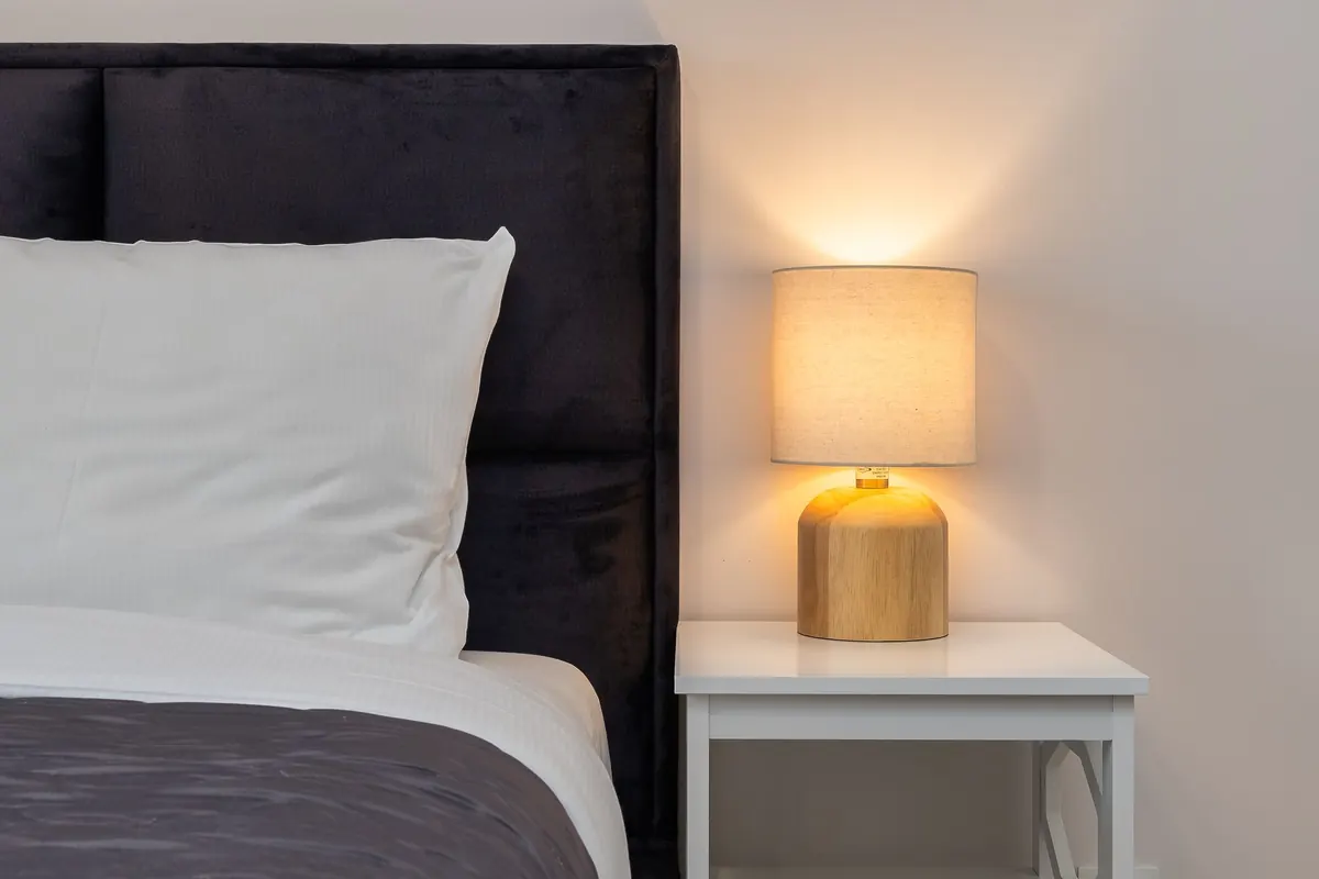


You paint a room, hang a nice shade, flip the switch — and something feels off. The walls look faintly grey. The sofa reads a different colour than it did in the shop. Nine times out of ten the culprit isn't the paint or the fabric. It's the bulb.
Colour temperature is the quiet variable in every room. Get it right and a space feels finished without anyone knowing why. Get it wrong and no amount of cushion-styling will rescue it. Here's how warm, neutral and cool white actually behave, and where each one belongs.
What colour temperature actually means
Colour temperature is measured in kelvin (K) and describes how warm or cool light looks — not how bright it is. Brightness is a separate figure, measured in lumens. A 2700K bulb and a 4000K bulb can both produce 800 lumens and look completely different doing it.
The scale runs from the amber glow of a candle to the blue-white of a bright overcast sky. In domestic lighting you'll mostly choose between three bands:
- Warm white: 2200K–3000K, with an amber or golden cast
- Neutral (or natural) white: 3500K–4500K, clean and fairly colourless
- Cool white (or daylight): 5000K–6500K, with a crisp blue-white cast
Packaging makes this harder than it needs to be. "Soft white", "warm glow" and "extra warm white" usually all mean somewhere near 2700K. Where you can, ignore the poetry and read the kelvin number.
Warm white: the default for rooms where you relax
Warm white is what most of us grew up with, and it's still the safest choice for the majority of a home. Its amber cast flatters skin tones, deepens wood and brick, and makes a room feel smaller — in a good way. It's the colour of lamplight, restaurant dining rooms and hotel lobbies at nine in the evening.
Living rooms, bedrooms, dining rooms and snug corners all sit comfortably at 2700K. Bedrooms can go warmer still, down to 2200K–2400K, which reads almost like candlelight. Pair warm bulbs with a dimmer and the room shifts from useful to restful with one turn of the dial.
The trade-off is detail. Under 2700K, black text on white paper looks soft, food can look slightly yellow, and dark blues and greens lose their punch. In a room where you're matching paint colours or chopping vegetables, warm white alone will frustrate you.
Neutral white: the practical middle ground
Neutral white, roughly 3500K–4500K, is the workhorse. It shows colour far more honestly than warm white, so tomatoes look red rather than orange and grey tiles stay grey. It's bright without feeling clinical, which is why it turns up in kitchens, bathrooms, hallways and utility rooms.
4000K is a good default for a home office or a kitchen worktop, especially in rooms with little natural light. It keeps you alert and makes small tasks easier. In a bedroom, though, neutral white can feel like a waiting room, and in a cosy living room it flattens the atmosphere completely.
If you want one temperature for a whole open-plan floor, 3000K is the compromise most designers reach for. It leans warm enough to be welcoming in the evening and stays clear enough to cook and read by.
Cool white: useful, but rarely for relaxing
Cool white starts around 5000K and climbs. It's the colour of garages, workshops and the office ceiling everyone complains about. It's also genuinely useful, because cool light boosts contrast and makes detailed work easier: sewing, model-making, soldering, sorting laundry, reading spreadsheets.
Places where it earns a place at home:
- Garages, basements and workshops
- Laundry and utility rooms, where you want to spot stains
- Task lamps for hobbies and close work
- Exterior security lights and motion sensors
- Bathrooms used mainly in the morning, if you need to wake up
Keep it out of bedrooms and evening living spaces. Bright, blue-leaning light tends to feel alerting rather than restful, which is the opposite of what you want an hour before bed. It also makes most skin tones look grey, and it clashes badly with warm wood and brass.
A quick room-by-room guide
- Living room: 2700K, dimmable, layered with table and floor lamps
- Bedroom: 2200K–2700K, dimmable, plus a warmer bedside lamp
- Dining room: 2700K at eye level or lower, on a dimmer
- Kitchen: 3000K–4000K overhead; 4000K under cabinets for prep
- Bathroom: 3000K–4000K, especially around the mirror
- Home office: 4000K, with the light beside you rather than behind you
- Hallway and stairs: 2700K–3000K, bright enough to feel safe
- Utility and laundry: 4000K
- Garage and workshop: 5000K–6500K
Small details that make a big difference
Once you've picked a temperature, a few practical points save a lot of second-guessing.
Match kelvin across visible fittings
Two bulbs at 2700K and 3000K from different brands can look noticeably different, especially in an open-plan room where you see both at once. Buy the same brand and range where you can, and keep a spare box.
Judge brightness in lumens, not watts
Watts tell you how much power a bulb draws, not how much light it gives. A living room fitting might need 400–800 lumens; a kitchen worktop, more like 800–1200. The kelvin figure sits beside it on the box.
Check the CRI if colour matters
CRI, the colour rendering index, describes how faithfully a bulb shows colour. Anything in the 80s is fine for hallways. For a dressing room or an art wall, look for 90 or above.
Test one bulb before you commit
Buy a single bulb, screw it in, and live with it for an evening. Light behaves differently against your wall colour, flooring and furniture than it did under the shop's ceiling. It's the cheapest way to avoid replacing six bulbs you don't like.
Choosing with confidence
If you remember one thing, make it this: warm white for relaxing, neutral white for working, cool white for detail. Most homes are happiest with 2700K in living spaces and bedrooms, 3000K to 4000K in kitchens, bathrooms and offices, and something cooler only in the garage or workshop.
Then layer it. A single bulb in the middle of the ceiling is a lighting plan the way one chair is a furnishing plan. Add a floor lamp, a table lamp and a dimmer, and the temperature matters less because you're no longer asking one light to do everything. Get the warmth right, and a room feels finished long before you've chosen the cushions.
Photo: Artem Podrez / Pexels
Related posts
More stories you’ll love reading